Design refresh
- Improved
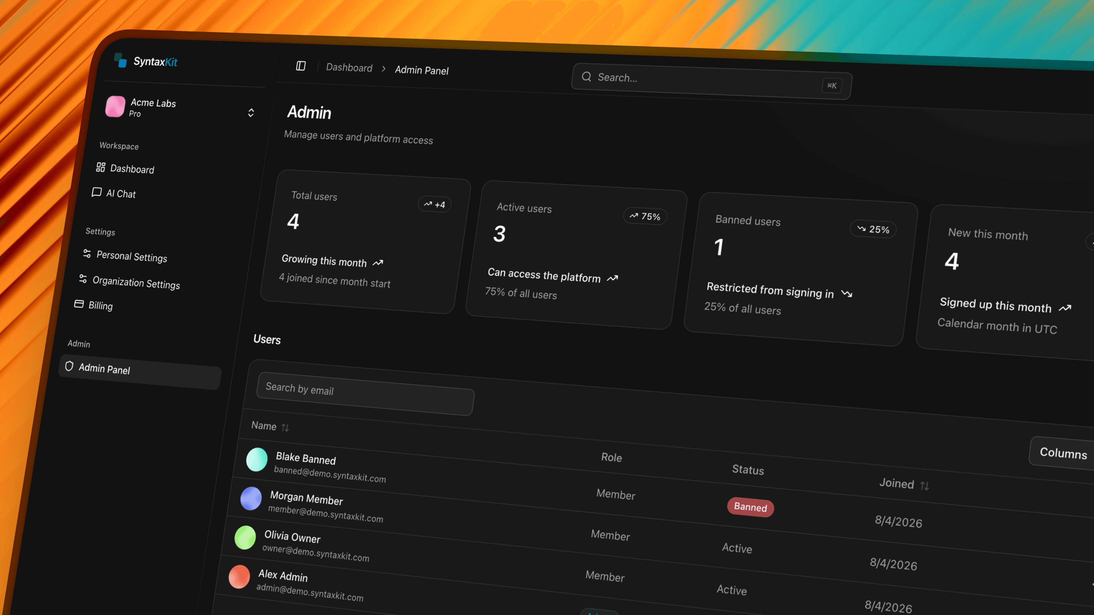
SyntaxKit no longer looks like a violet UI kit with an admin product bolted on. This pass touched the brand color, surface treatment, motion, the admin area, and the homepage copy.
Blue is the brand now
The design tokens moved from violet to blue, with primary landing at roughly #007DBD in light mode. App and docs icons, the Apple touch icon, all the feature art SVGs, and the customization docs were updated to match. Surfaces went the other way: page, card, and hover tokens are locked to neutral grays in both themes, and the primary-tinted atmosphere was stripped from dashboard and marketing chrome. Blue reads as a deliberate accent, not a wash over everything.
Calmer surfaces, quicker feel
Glass effects are now reserved for focal surfaces instead of appearing everywhere. Interaction motion was tightened, and the page entrance animations that played after skeletons were removed entirely, so navigations feel immediate rather than choreographed. Settings chrome collapsed into shared card and section primitives, and the skeleton primitives were simplified to match.
Admin feels like the same app
The admin list and user detail pages adopted the same settings shell and section-card patterns as the rest of the product, with quieter table density and delete flows aligned with the DangerZone patterns used elsewhere. Impersonation got a proper dialog, admin pages got dedicated loading skeletons, and the stats footers now behave when there are zero new joins in a period.
The homepage sells what ships
The FAQ, integrations, and billing sections on the homepage were rewritten in both English and German. The old copy still told a "shadcn UI blocks" story; the new copy describes the actual product: Better Auth, multi-tenant organizations, Stripe with real entitlements, streaming AI chat, and a type-safe oRPC API.